DiA tokyo
PROJECT DESCRIPTION
DiA tokyo is a three-story nightclub and restaurant located in Roppongi, Tokyo. Before DiA Tokyo's grand opening in December 2016, TURNED ON was hired to design the logo and website. These projects were under tight time constraints, but our team managed to develop a website and logo package for our client quickly and efficiently. Later in 2017, DiA tokyo was not satisfied with their in-house designer, so our team was hired again to take over all the flyer designs.
KEY TASKS
Web Design, Development and Management
Logo Design
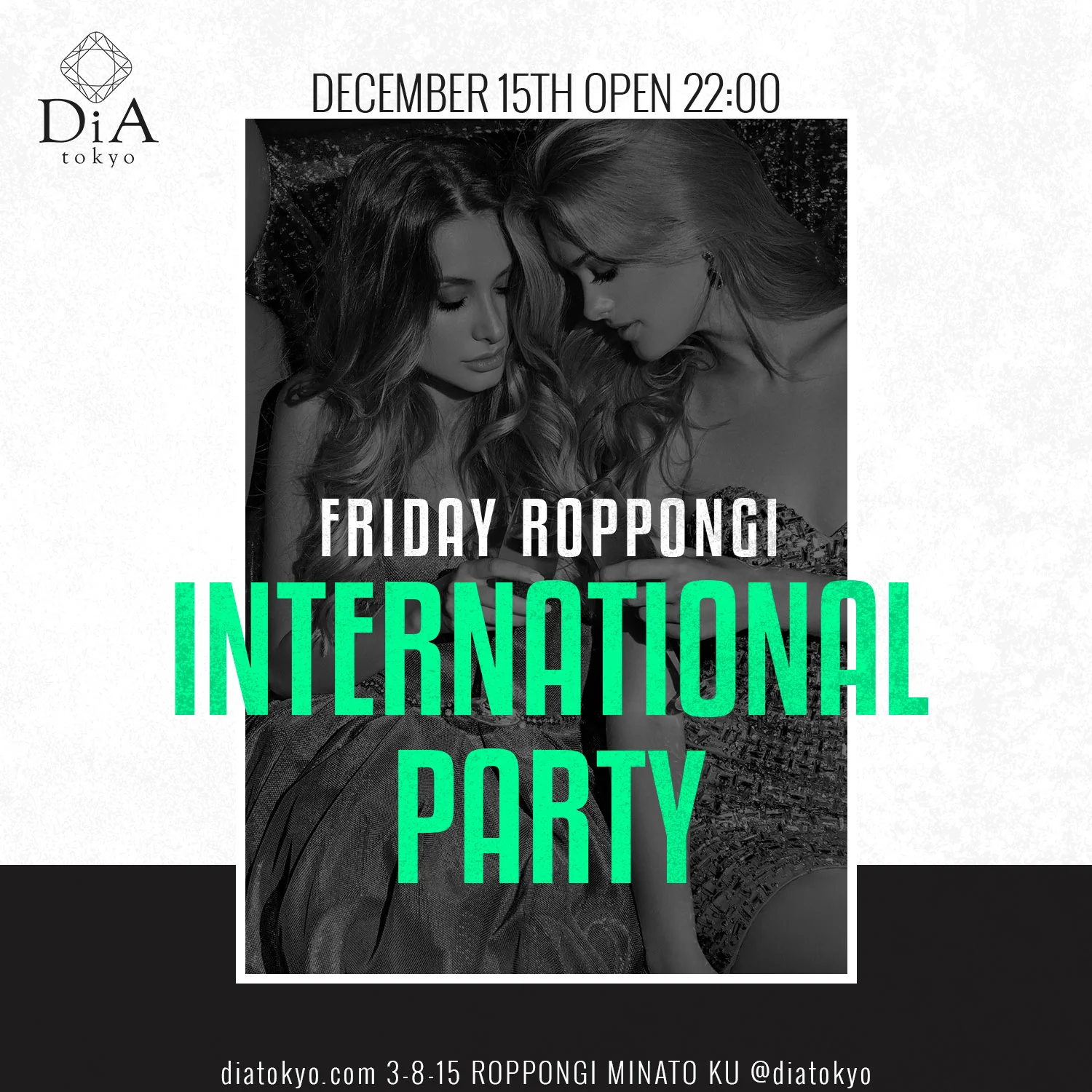
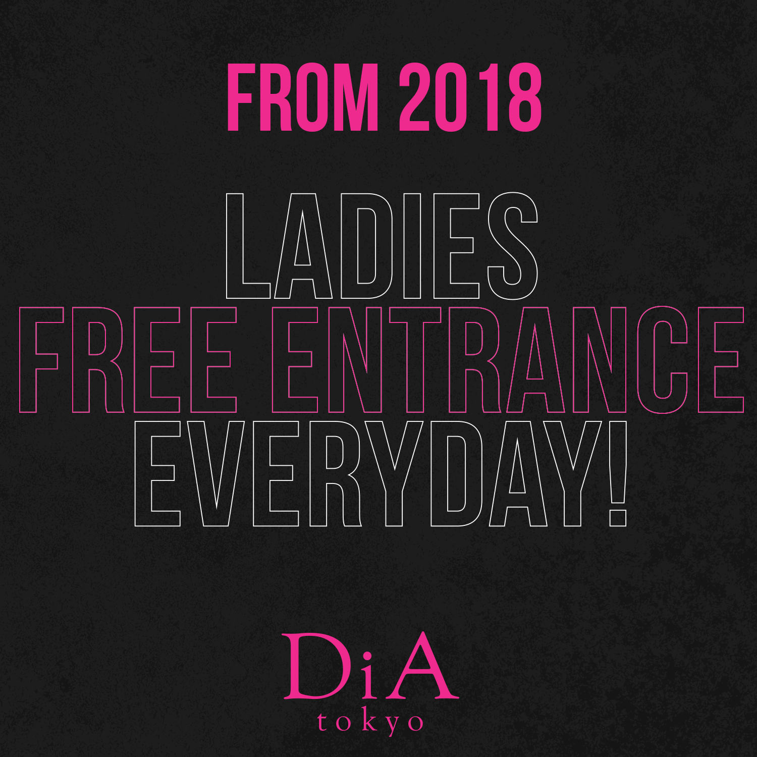
Flyer Design
Print Design
WEBSITE PROJECT
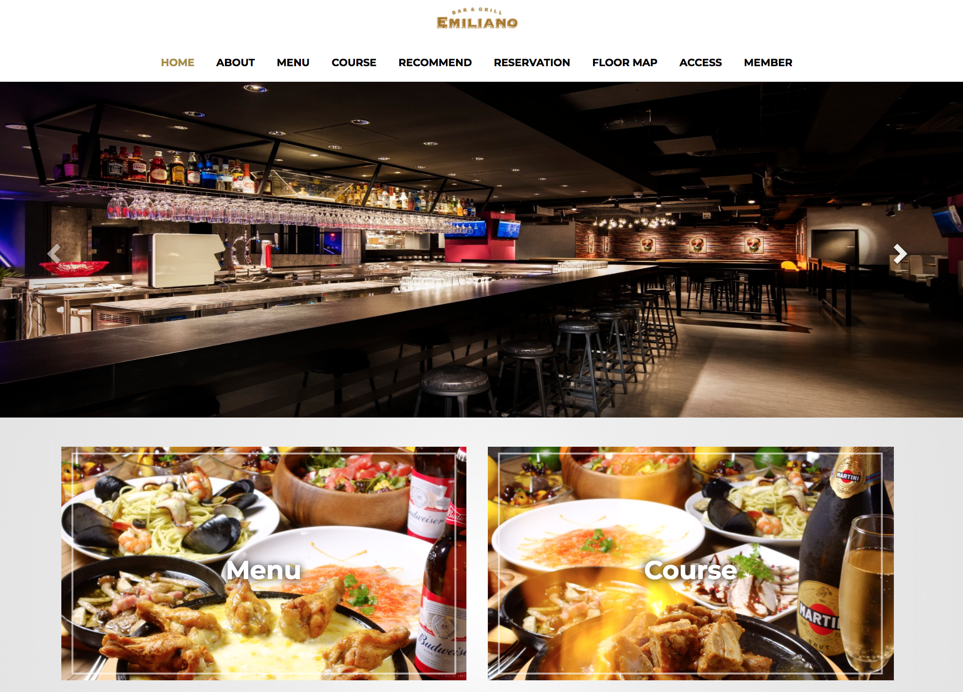
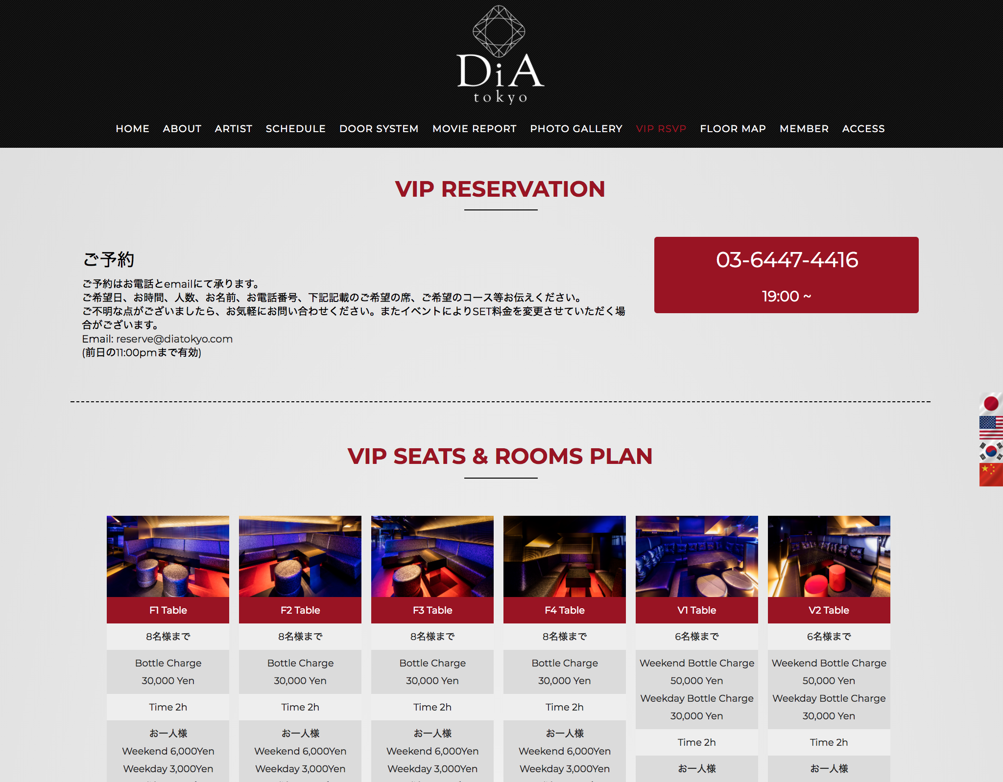
TURNED ON was hired to develop the DiA tokyo's website in late 2016 with a strict one month deadline.
Our team created for different sub pages for the restaurant, lounge, party and clubs. On key pages we installed language options including Japanese, English, Chinese and Korean.
We developed an event management system so the club managers could easily add, edit and remove events to a monthly calendar. In addition, we created functionality to add artists, edit nearly every aspect of the website, and update banners.
LOGO DESIGN
DiA, sounds like Diamond in the Japanese language. Therefore when DiA tokyo's management approached us about designing their logo, they wanted to have a diamond icon incorporated into the look of the logo.
In addition, we were requested to mimic the look of Dior's lettering. The final result a logo that presents an image of class and luxury.
We created four different color configurations, which the client could utilize in their print and digital marketing.